Interior Colour Trends to Watch this Year
Home design author Jenny Kakoudakis talks through the interior colour trends we’re obsessing over this year, and how to bring them to life in our decor…
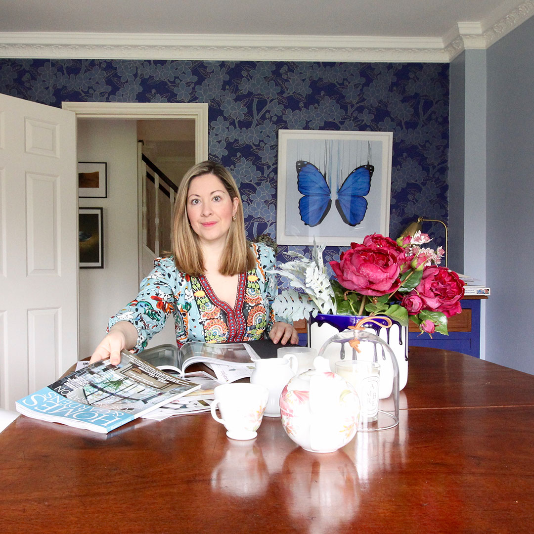
Jenny Kakoudakis – author of the Seasons in Colour Interior Design blog
Do you spend time worrying about interiors trends and how they may change over time? At Seasons in Colour we feel that trends are there to guide some of our choices, but when it comes to decorating our homes we should choose based on our long-term preferences instead of trying to force particular colourways into our lives.
Some colour trends seem to be repeated this year which is quite a relief as it means that those lucky enough to already use them at home will not have to change a thing. Do any of these interior colour trends make your heart sing?
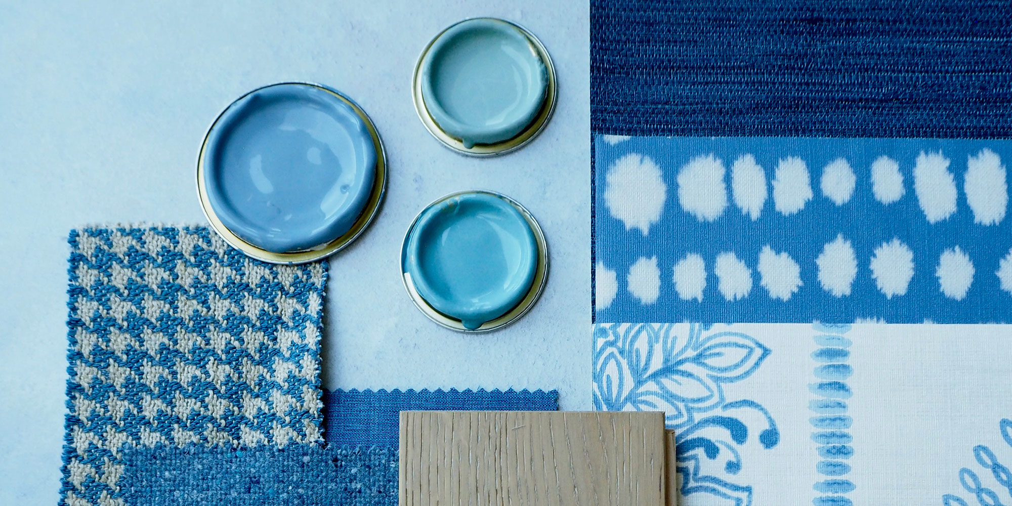
BLUE
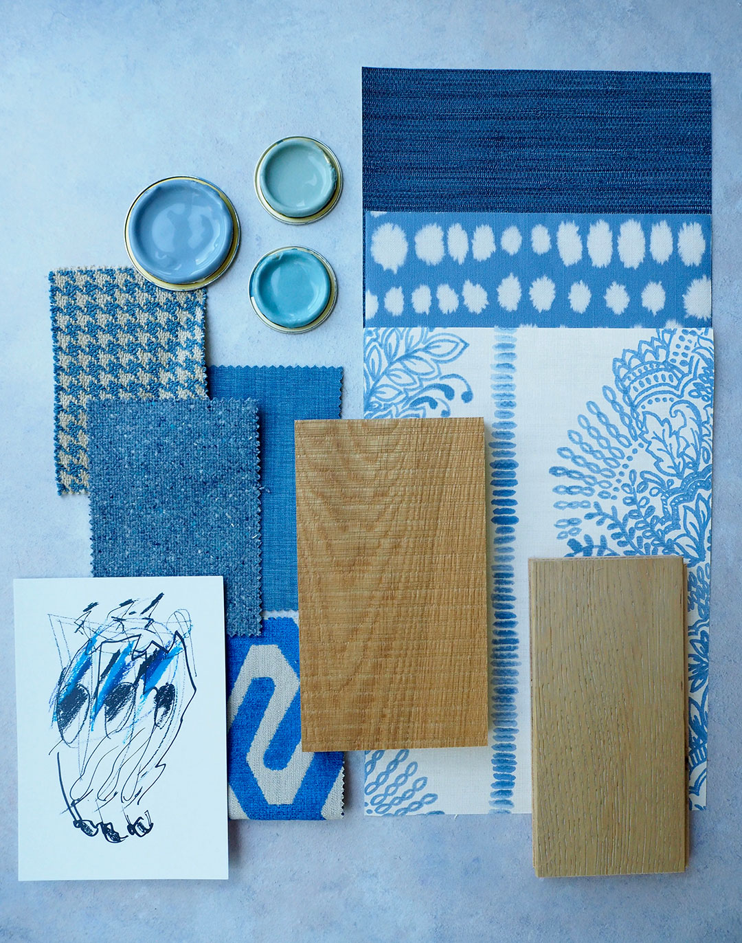
Photo: Jenny Kakoudakis for Woodpecker – features Chepstow Sawn Natural and Goodrich Feather Oak
I don’t think you can go wrong with blue this year. A popular colour with interior designers, blue has moved from our walls to fabrics and accessories. A key change, however, is the hues in which we find it used. A few years ago, dark and blues like Stiffkey Blue and Hague Blue (both Farrow & Ball) are now replaced by lighter versions like Pale Wedgwood (Little Greene).
These softer blues work well with pale wood floors and brass finishes to create a calming and contemporary atmosphere as seen here in the home of Danish photographer Mikkel Adsbol. To make this look work in your home, choose a light grey blue for your walls and indigo coloured curtains to frame your windows. Keep to one colour and accessorise with a combination of different tones, for example on your sofa cushions.
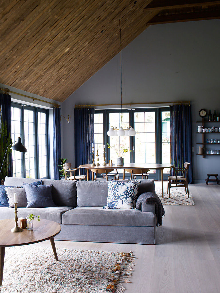
Photo: Mikkel Adsbøl for Bo Bedre
If you love blue but your home doesn’t get a lot of light from the South, you may end up with rooms that feel quite cold. To warm up the room, choose a wood with more yellow undertones. This is an especially beautiful combination that can work in family rooms where more colour is needed, without overwhelming.
Teal and Hot Pink
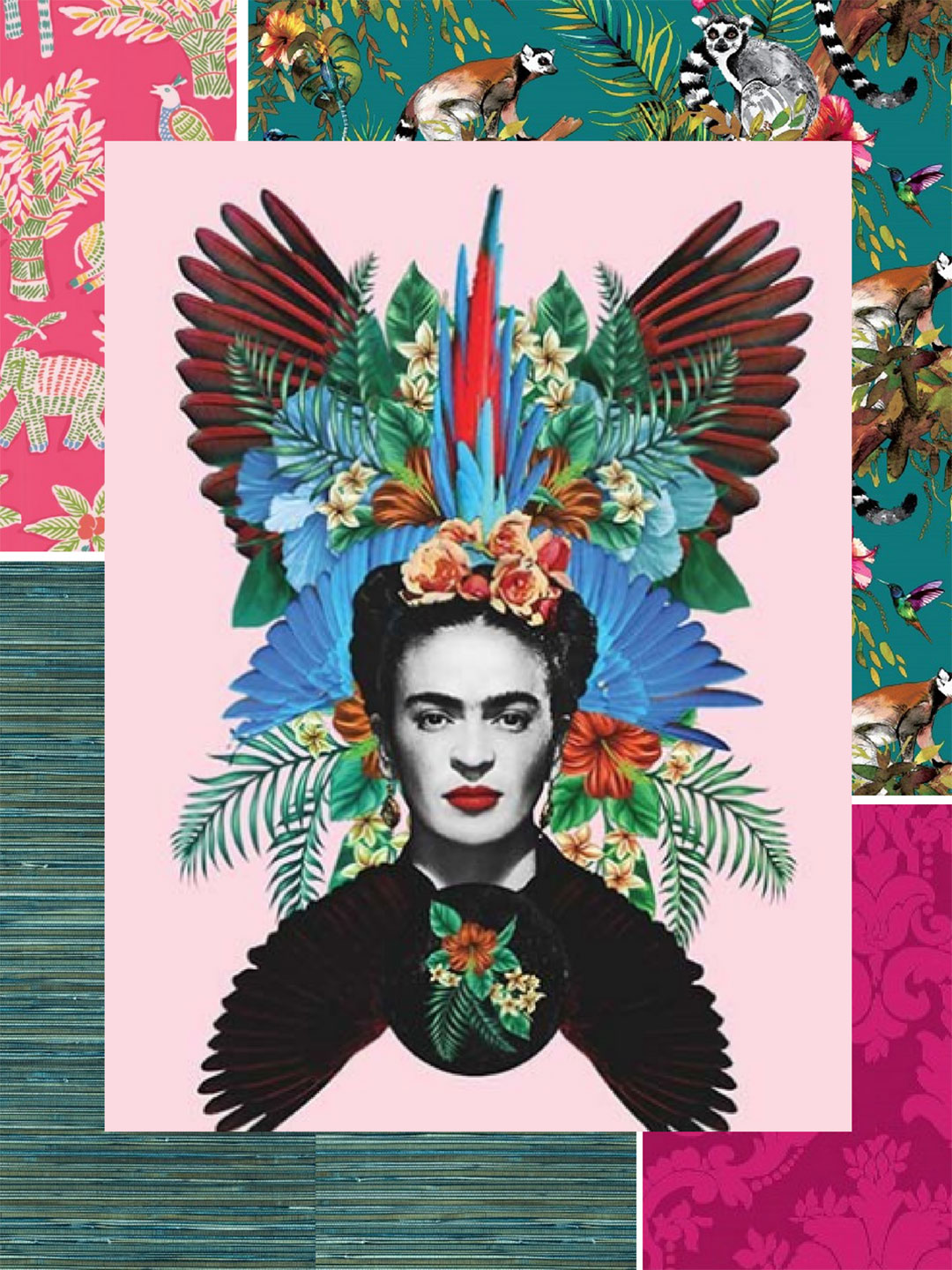
Photo: Jenny Kakoudakis for Woodpecker
Hot (and even neon) pink is definitely going to have its moment in 2019 but only as an accent colour. It is currently surfacing in art (check Saatchi Art for inspiration) as well as in accessories – the recent interior shows in the UK all included an abundance of homeware in this cheerful colour.
Pink works in harmony with teal. We see it as the grown-up version of Pantone’s 2016 Rose Quartz and Serenity pair; It is perfect for the maximalists amongst you.
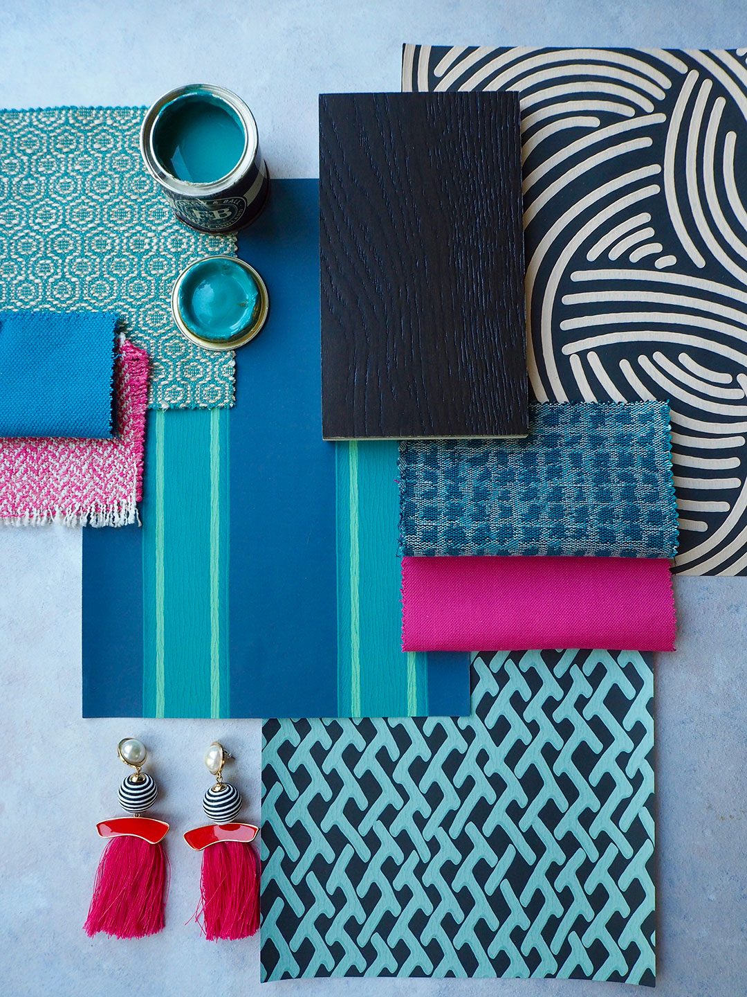
Photos: Jenny Kakoudakis for Woodpecker – features Goodrich Milton Oak
This powerful combination could be used in a room with walls painted in green-ish blue (try Farrow & Ball Vardo) or similar coloured wallpaper (try this block print striped one) and curtains or blinds, cushions or the odd accent chair dressed in hot pink. Not for the faint-hearted, these two colours are fighting for attention so add drama with a really dark floor and embrace the cosiness they will bring to your décor.
If it is a vibrant look that you are after, then add the teal (paint or wallpaper) on a single, accent wall and decorate the rest of the room in a very light white. That way you can use hot pink more freely and the room will not feel stuffy. Indeed, this is the perfect way to add some fun in your décor. When choosing this option, a lighter coloured floor is recommended.
Monochrome
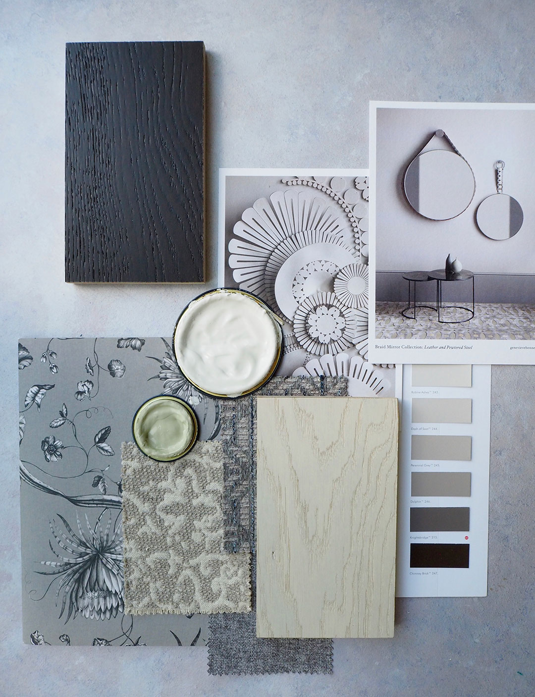
Photo: Jenny Kakoudakis for Woodpecker – features Goodrich Milton Oak and Salcombe Sandy Oak
A colour scheme of mainly white and grey with earthy tones can make your interior feel more spacious. No doubt, Scandinavian design still appeals to many and offers a simplistic approach to decorating a home and it is the main influencer behind the use of this palette.
If Nordic design is really important to you, a dark coloured floor will help you ground the scheme and layer everything around it. You can also introduce black accessories more freely without them standing out too much.
For an equally pared-back space you can also use a light-coloured wood on the floor and use texture as a means of layering. This can be done through small area rugs in natural material, and similarly coloured throws and cushions that will make the look feel very organic.
Warm colours
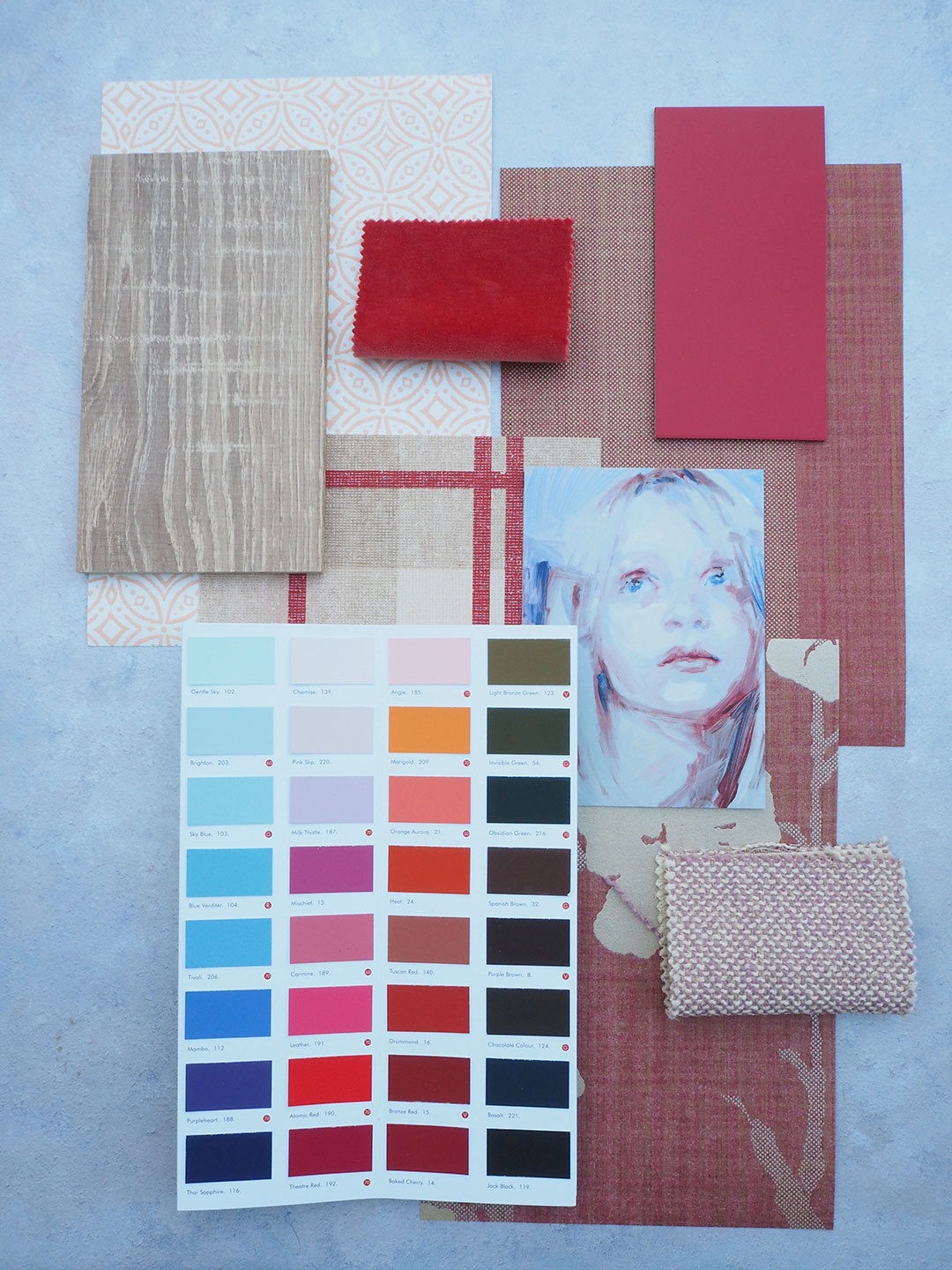
Photo: Jenny Kakoudakis for Woodpecker. Lynton Seagrass Oak works well here.
From rich terracotta to sumptuous red, warm colours and talked about in most interior shows. They can really make a house feel like home. If used correctly, they can feel very contemporary but they won’t suit every room in the house. Use them in smaller furniture (like dining chairs) and lighting and ideally keep them around the kitchen. A lighter coloured floor would suit these hues.
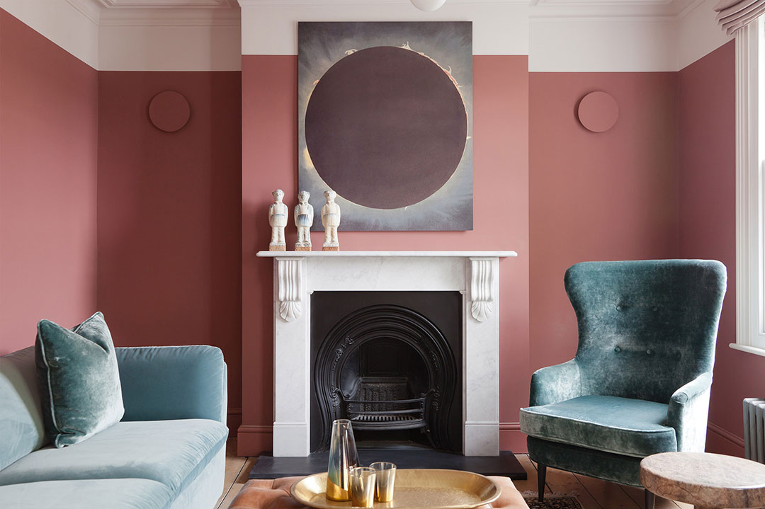
Photo: 2LG Studio, from their Upper Brockley Road project
For the more adventurous, red trimming around the room is definitely a show stopper. You can use it on woodwork or around curtain borders too. One of the colour combinations we absolutely love is tomato red with a lighter blue like Little Greene’s Tivoli.
Metallics

Photo: Jenny Kakoudakis for Woodpecker – features Goodrich Milton Oak
Looking forward towards the rest of 2018, metallics will continue to dominate interiors, with brass now being the material of preference for lighting and bathroom fixtures. Without a doubt, brass and gold ooze luxury and opulence and as we invest more in our homes to do them up, this luxury factor is something that we often aim for.
One new product that has caught our eye recently are wallpapers that incorporate these metallic highlights (see the latest collection of Kelly Hoppen wallpapers here and in particular ‘Splatter’). So what works well with metallics? In our view, dark coloured floors will add some wow factor to the look, but for something even better, try a beautiful chevron styled floor (chevron floors and marble surfaces are currently trending on Pinterest and we will see more of them in 2019).
Green – Botanical trend
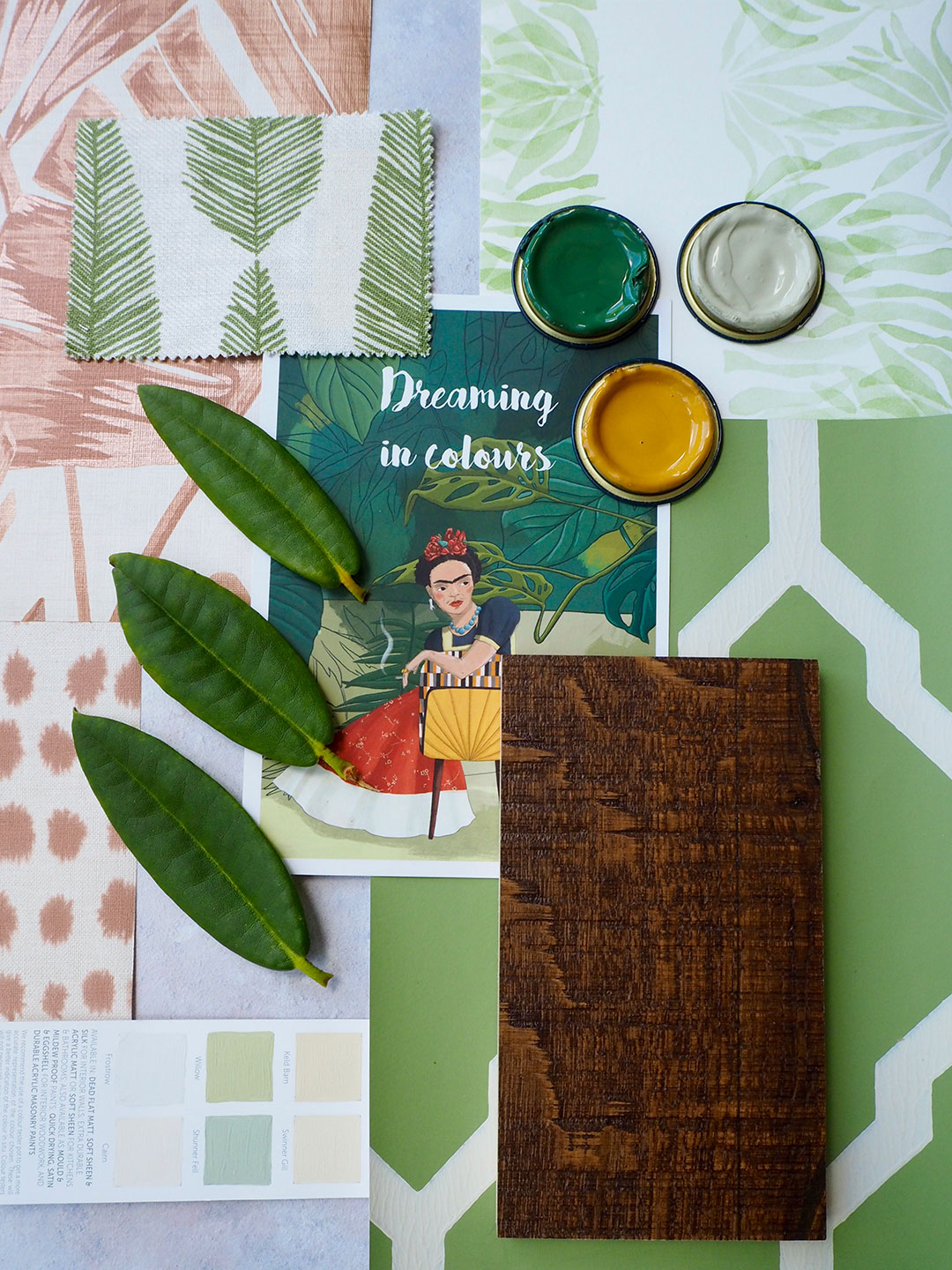
Photo: Jenny Kakoudakis for Woodpecker – features Berkeley Reclaim Oak
And for those who still want more Instagram worthy homes? Green is here to stay with more green sofas now being ordered than any other colour according to one well known high street sofa store.
When choosing green in your colour scheme, you are going for fresh, lively style. Green can be very versatile but make sure you choose the hue well. Too much yellow undertones and your room will remind guests of Kermit the Frog.
In fabrics, use plain green for your sofa and a patterned design for armchairs or ottomans. When it comes to paint: if using green in your bedroom, a moody hue will be more relaxing long term. Keep an eye for a brand new colour card that is launched in July 2018 from Little Greene and will incorporate some interesting choices in this particular hue.
Use it together with other colours often found in nature, like brown for a very organic look. And when it comes to flooring, try to pick something with texture on it like the Chepstow Sawn Natural Oak.
