Modern Grey Herringbone In a Beautifully Minimal Home
Modern design aficionado and writer of the popular interiors blog Design Hunter, Helen chose Feather Oak from Woodpecker’s Goodrich collection for her new living room renovation. Read on to find out why this contemporary herringbone design was the perfect fit and be inspired by how Helen styled her space around it.
Helen, Design Hunter
We bought our 1930s home in Leamington Spa last year. When we moved in the house was in desperate need of modernisation – it hadn’t been touched for decades. We deliberately chose a property that needed complete renovation as we wanted to have the opportunity to put our own stamp on it throughout. We knew that we had a lot of work to do but we were up for the challenge.
Before fitting the new floor we took the walls back to brick and had them re-plastered. We also took up the old original floorboards which were quite badly damaged. We then laid a new plywood subfloor as a base for our chosen flooring.
Featuring Goodrich Feather Oak
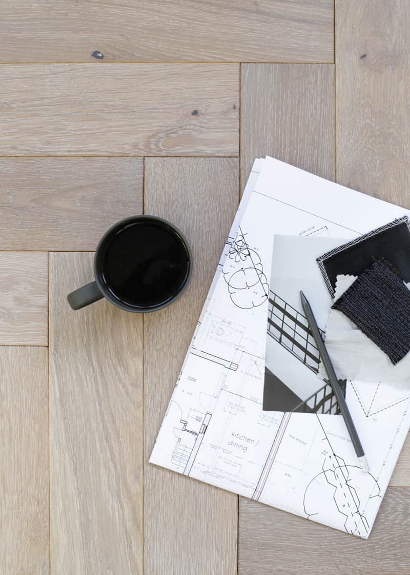
We looked at a lot of samples before eventually deciding on the Feather Oak parquet from Woodpecker’s Goodrich collection. When we first began thinking about how we would design the space we were originally drawn to lighter white toned woods but after seeing a sample section of the Feather Oak laid out we changed our mind. It’s a lovely soft, mid toned colour with a slightly grey finish, but was still light enough for the clean, modern look we wanted to achieve.
One key piece of advice I’d offer to anyone who is about to fit wood flooring in their home is that once you’ve drawn up a shortlist of the floors you like it’s really worth visiting a showroom where you can view sections of them laid out if possible. It’s really difficult to get a feel for how a particular wood will look in your home from just viewing it online or seeing a small sample piece. Making the wrong decision could potentially be very costly, so it may even be worth buying a sample box and mocking up a section in the area of your home where you plan to use it to help you confirm your final decision. We did this and it enabled us to subsequently order the quantity we needed for our project secure in the knowledge that we’d definitely made the right choice and that it was going to look amazing!
By doing this we were also able to view the product in different lighting conditions – from bright natural daylight to subdued evening mood lighting. In fact this was one of the reasons we eventually ended up choosing the Goodrich parquet. I just loved the texture it had in comparison to some other products I looked at and the way the light catches the subtle grain detail on the soft brushed surface. This is something I just wouldn’t have been able to get a sense of from looking at a small sample piece.
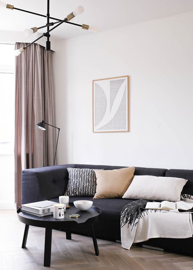
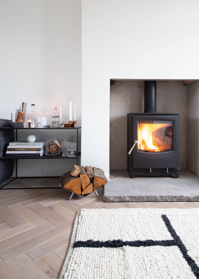
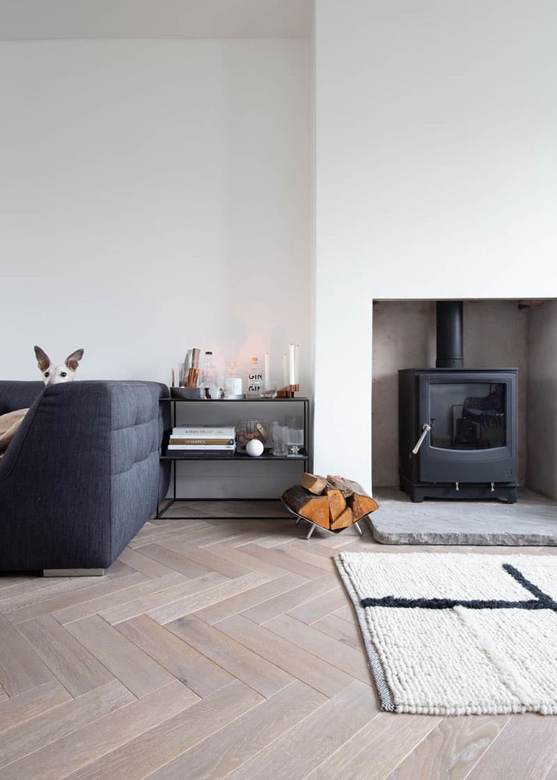
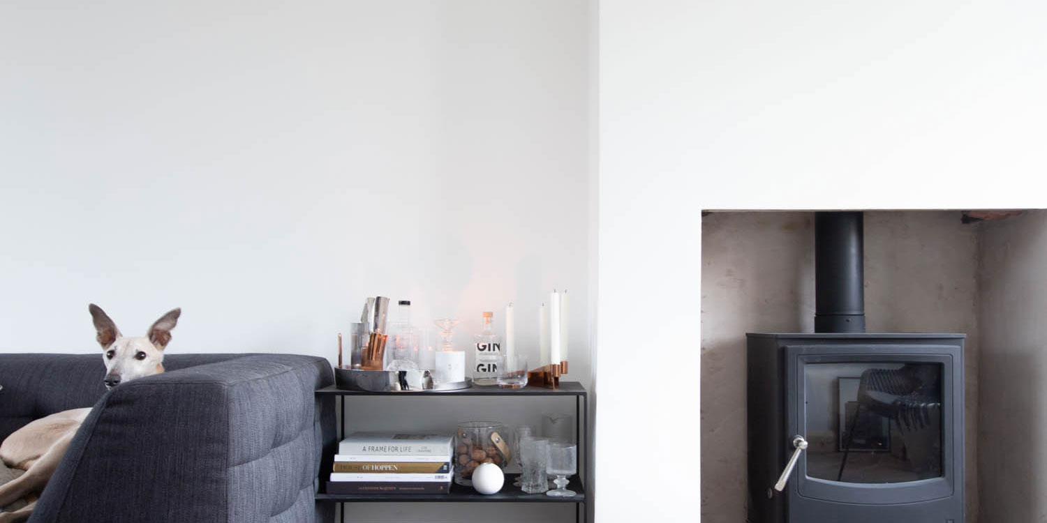
We gave lots of thought to the look we wanted to achieve and to the other colours and materials the floor would sit next to, opting for white walls with lots of natural materials like wool and stone and black metal light fittings with a contemporary industrial feel. The soft grey tone of the floor provides the perfect backdrop for this, providing warmth and texture. I particularly love how it complements the hearthstone we chose for the wood burner.
Featuring Goodrich Feather Oak
I’m also really happy with the proportions of the product we chose. Engineered wood flooring is available in varying different shapes and sizes from large wide planks to smaller parquet blocks that allow you to create a more interesting surface pattern. The size and shape of the wood you choose will have a considerable impact on the finished effect, so it’s important to consider this as well as the colour and surface texture.
Chevron designs are very popular at the moment and they can look great, particularly if you want to achieve a strong, contemporary look, but we weren’t sure this type of pattern would work for us. Our living room is long, rather than square, as it was originally two smaller rooms that were knocked into one. We felt that a chevron pattern might visually accentuate the length of the room and make it feel narrower by leading the eye in a single direction. Conversely, the traditional parquet pattern we chose encourages the eye to travel around the room in a more even manner. This is a clever little design trick that really worked for us – I think it makes the space feel wider than a more linear pattern might have done.
Our floor fitter did a brilliant job and we are totally in love with the end result. We look forward to enjoying our Woodpecker parquet flooring for many years to come!

