Features That Make a Great Showroom
All of our customers have great showrooms, but there are some features which further enchance the customer experience and we’d like to share these with you. Rest assured, these are just a few examples of the fantastic showrooms out there. If we haven’t showcased yours, please feel free to send us some pictures and we’ll highlight yours next time.
Kustom Floors – Bedminster
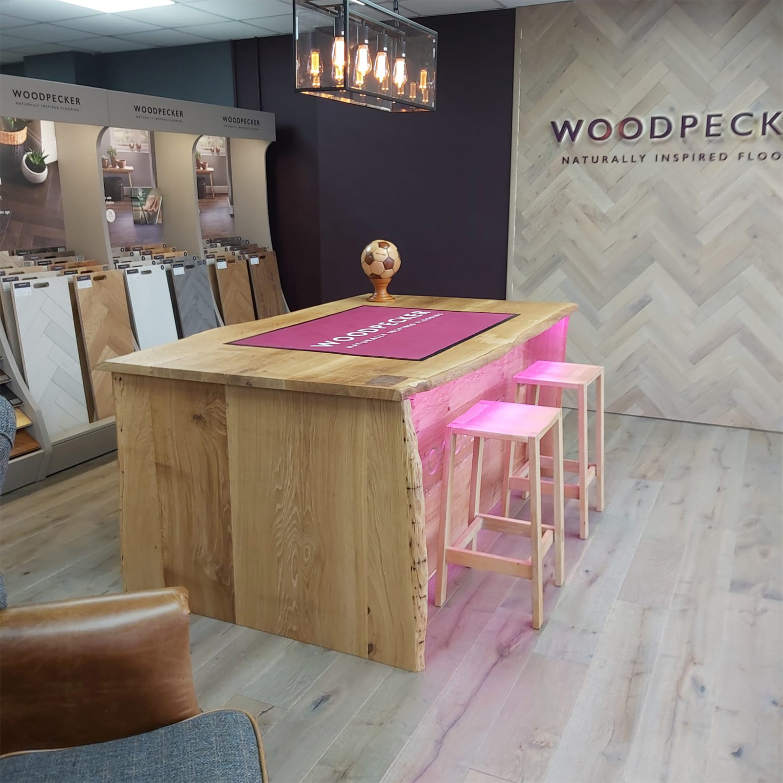
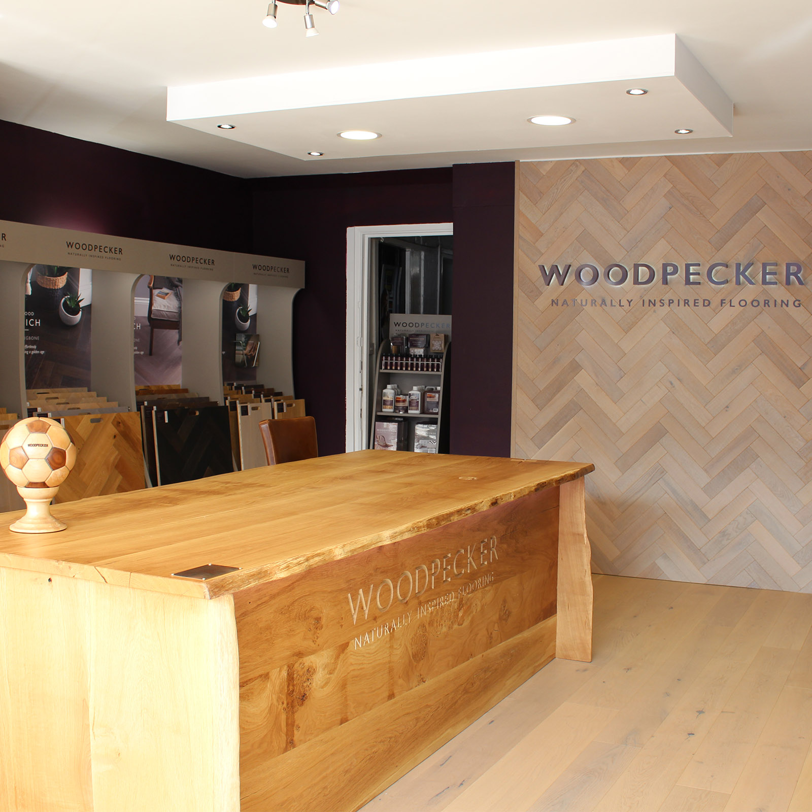
The Bedminster store has a real feel of quality. You’re instantly immersed in a feeling of luxury with the deep Woodpecker wine colour scheme, paired with the Legacy table and herringbone wall. Situated in the main windows at the front of the store, this showroom has a strong appeal for the passer by before stepping into a showroom that delivers a superb experience.
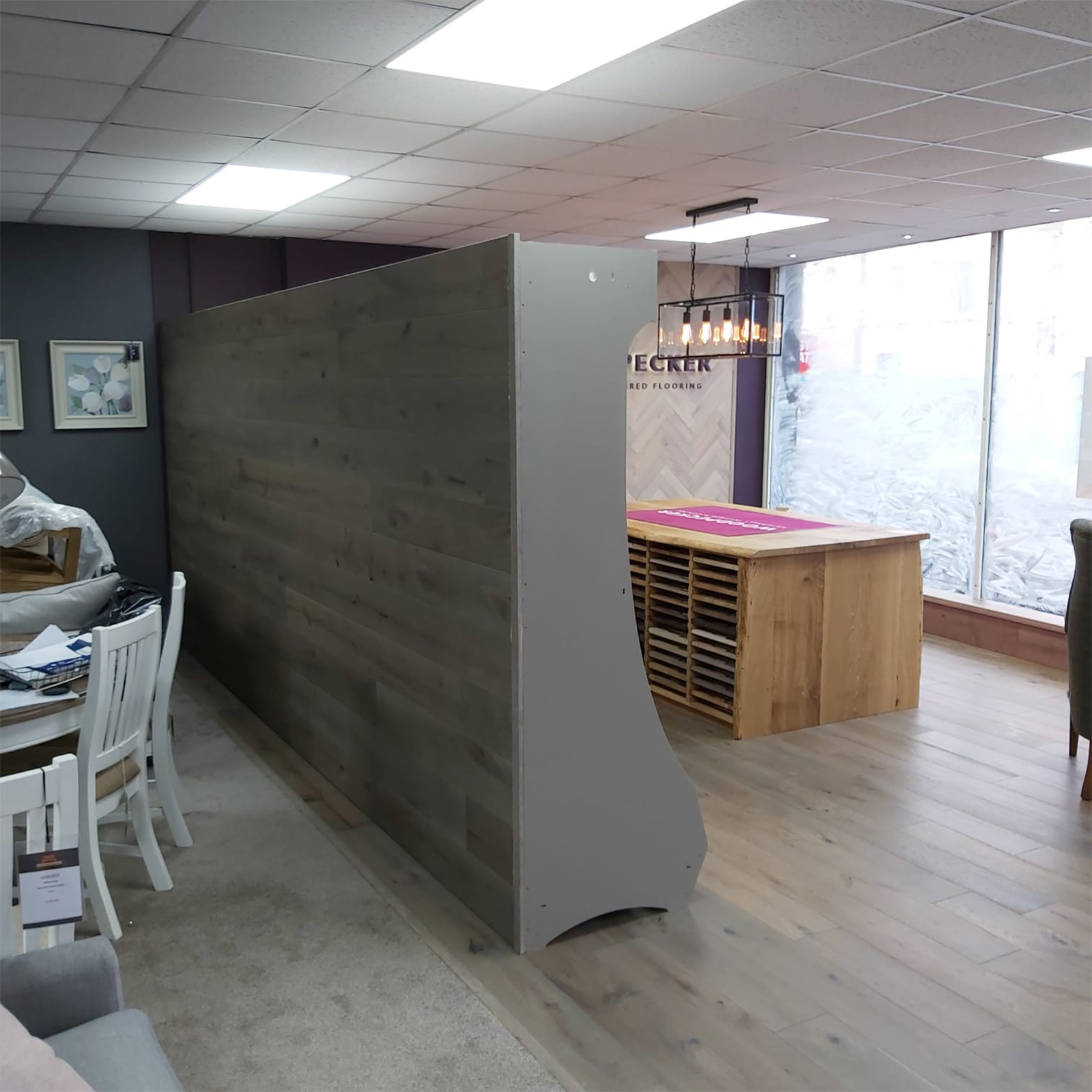
Ever creative, they’ve cladded the back of the stand with our Berkeley Calico Oak using the Woodpecker wall clips – stylish and interior design masterpiece.
1 to 1 Flooring – St Albans
The St Albans store has its own separate Woodpecker sanctuary where consumers come to really feel the Woodpecker family spirit. Every wall is cloaked in the Woodpecker wine colour, which really embraces the brand and creates a truly mellowing experience.
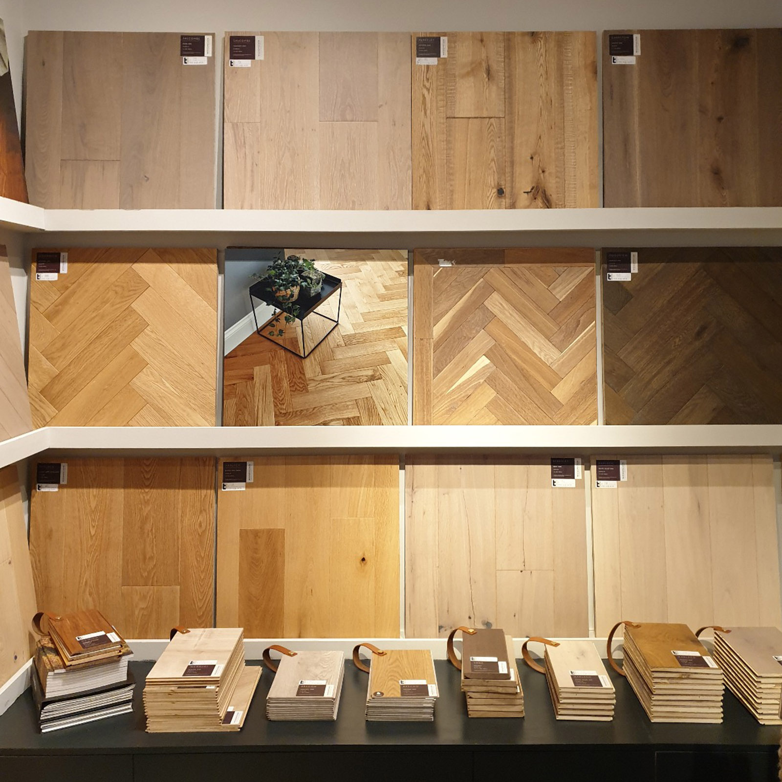
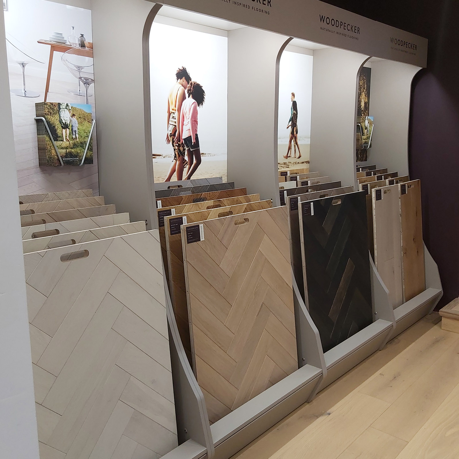
With herringbone trending, this store has utilised our extra wide sample boards to emphasise the beauty of each Goodrich parquet floor.
All About Flooring
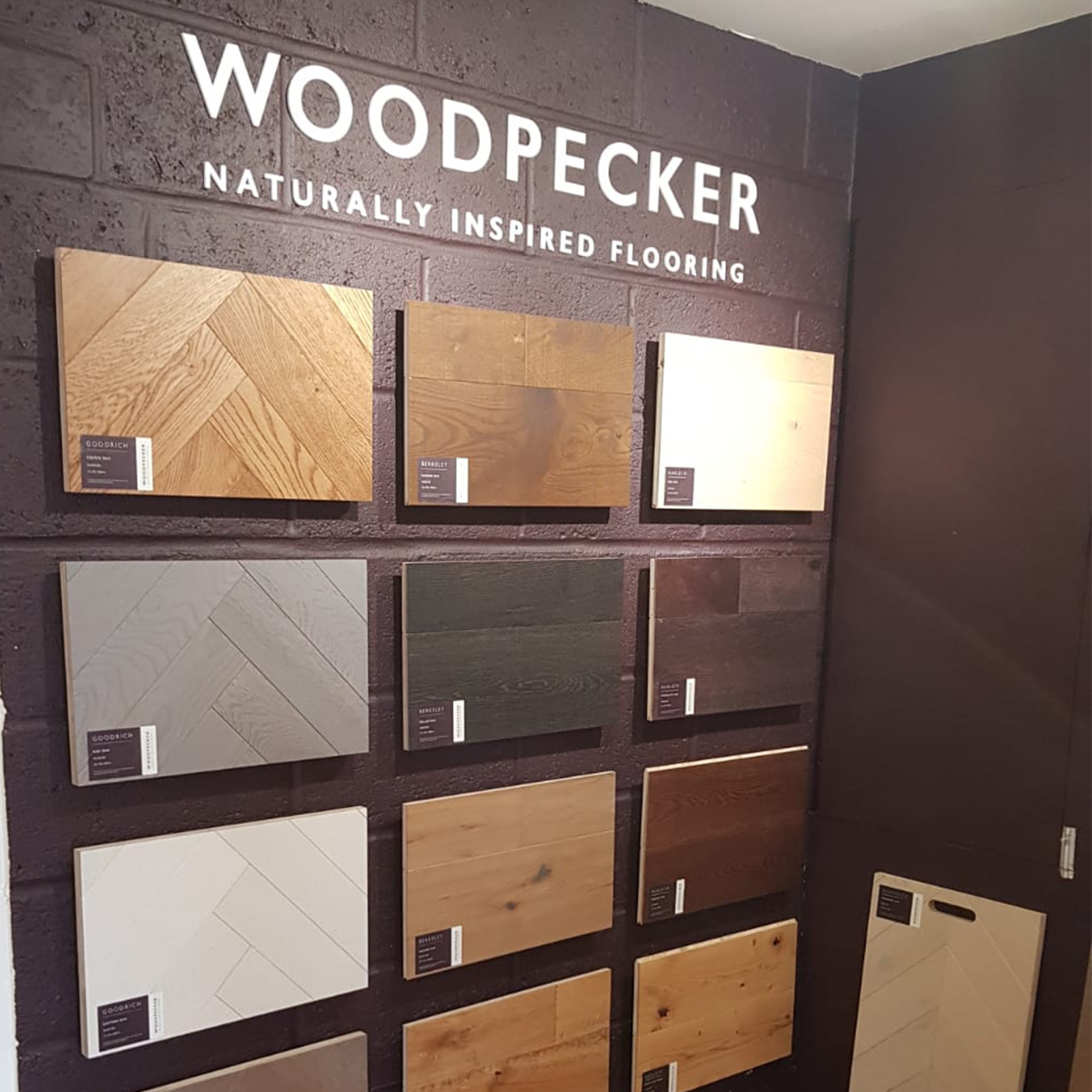
A hall of fame concept is a fantastic way to utilise space and showcase a snapshot of our most popular floors and ranges.
Amour Flooring
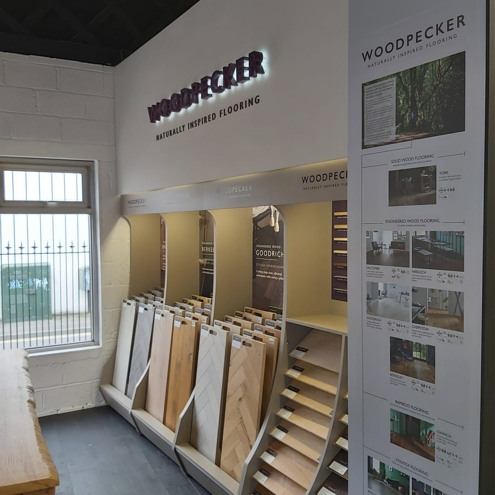
Captured in its own space this showroom has recessed its point of sale stands back into the wall.
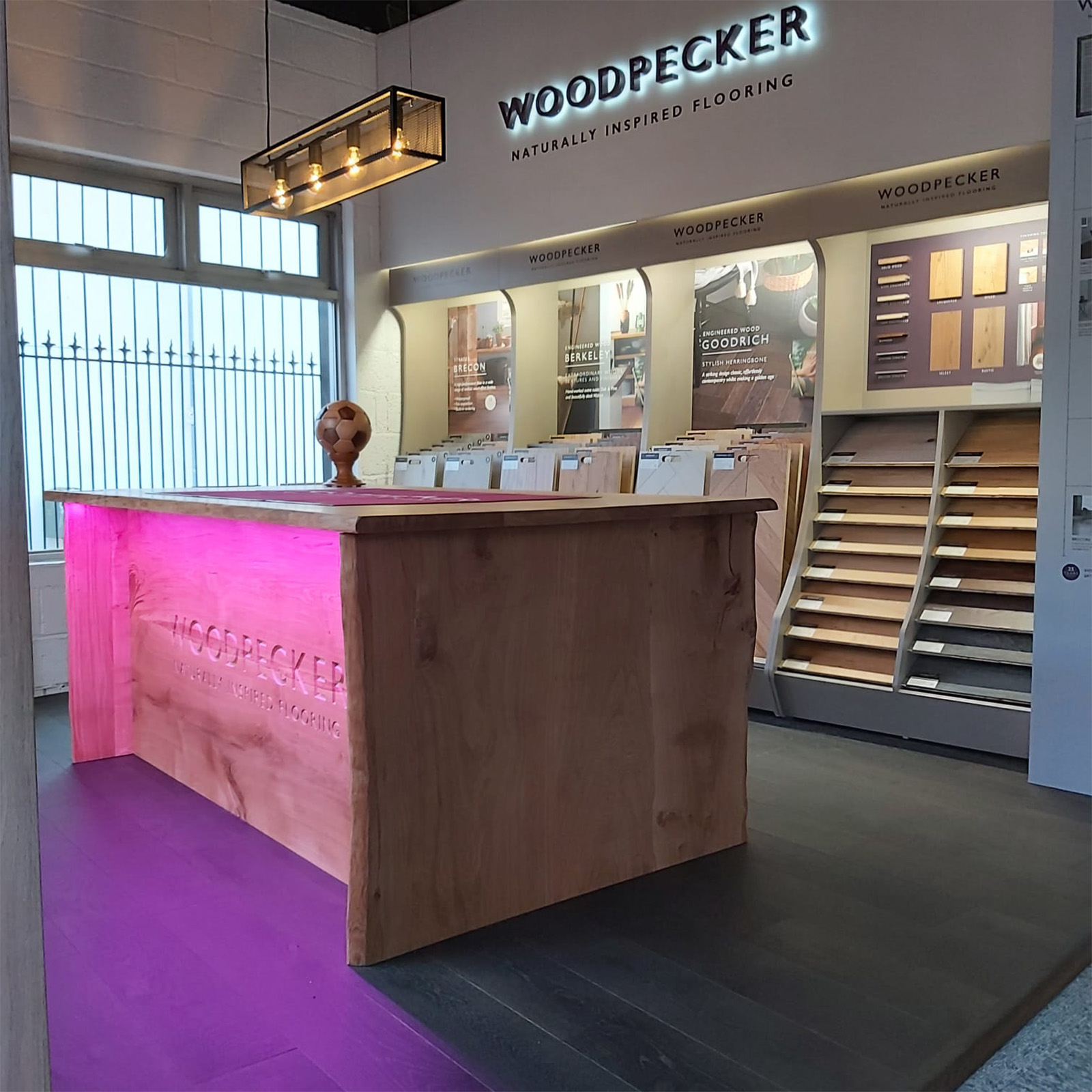
We particularly love the large infographic which serves as a training tool for staff as well as an information wall for customers. It’s a really handy tool to use whilst talking through our various ranges and floor specifications with customers.
Arighi Bianchi
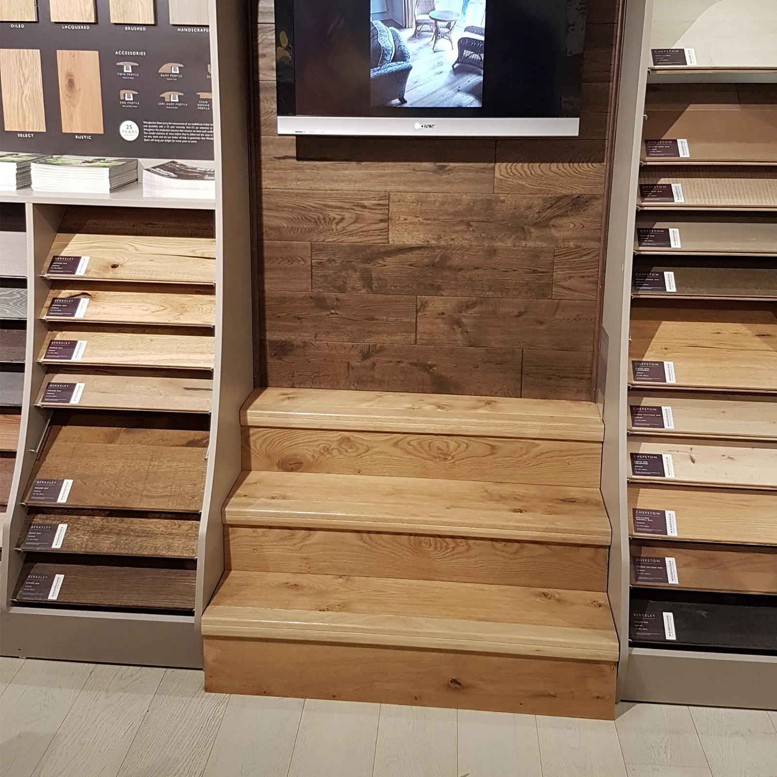
Now this is a stylish and modern way to display our flooring accessories and to demonstrate wood flooring on steps. A simple solution indeed, but it shows the capability of the product in a very visual format.
Ceramic Tile Warehouse
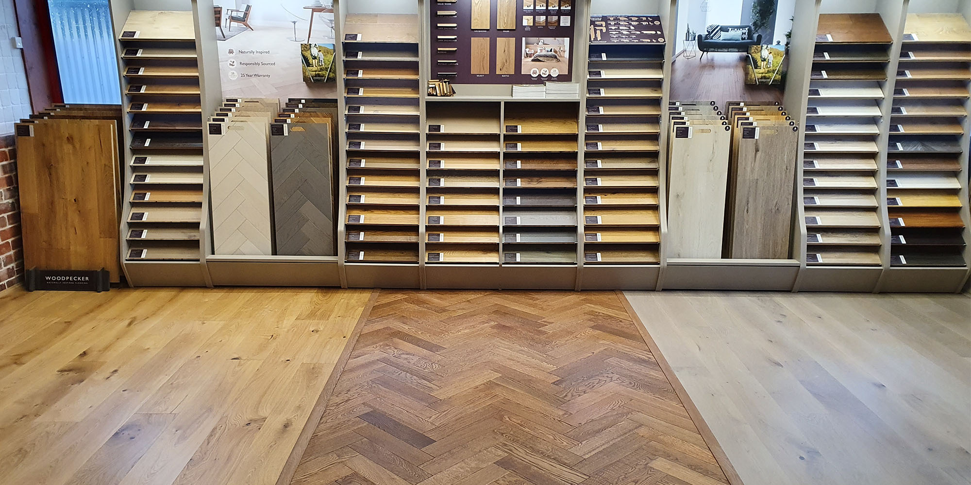
This customer has the luxury of space and what a beautiful display area they have. Utilising the full length of the wall, they show a wide selection of ranges in both sample form and laid floors.
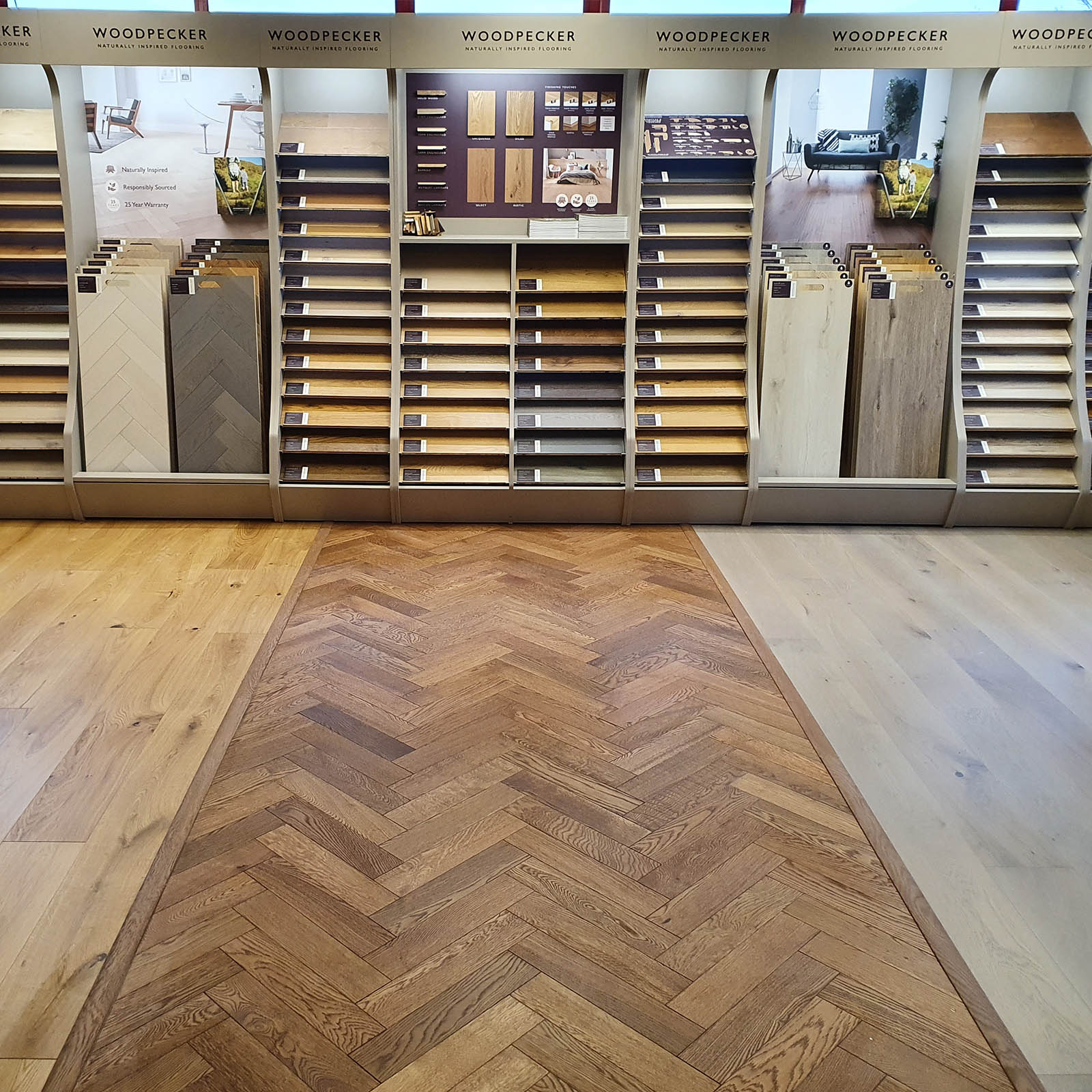
What is really noticeable is the floor. By using 3 distinct styles as their own showroom floor, it brings the area to life. More importantly, it helps the customers to visualise what the floors may look like in their own space as well as offering a fantastic insight into the colour and detail variation of each style.
Rockform
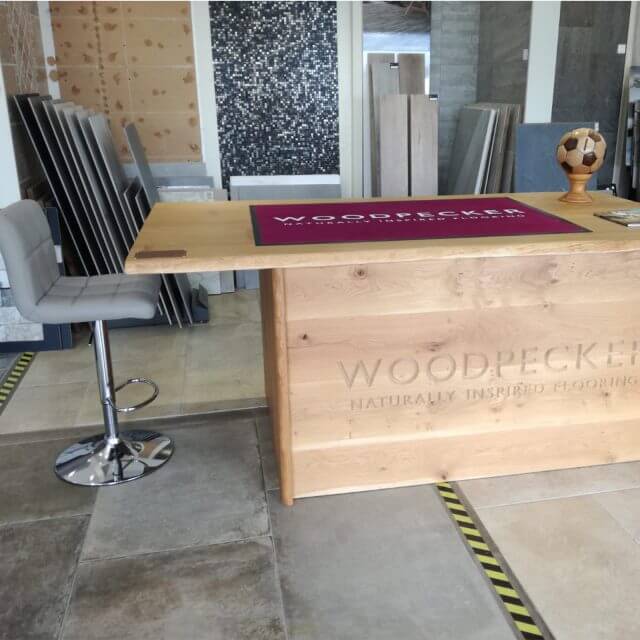
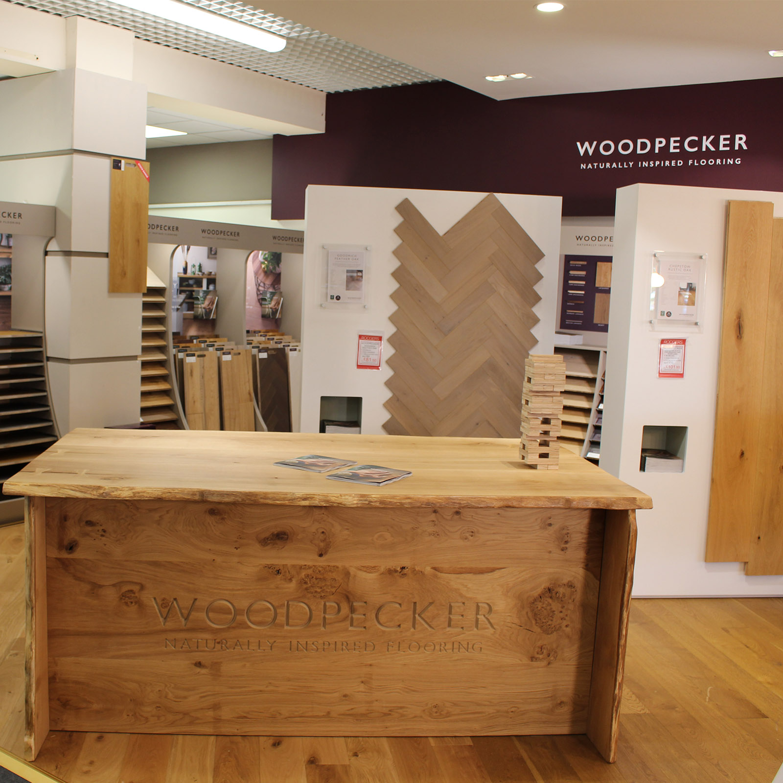
Rockform opted for the table bar… it’s something a little different and provides a great experience for the customer, as they sit at the Legacy piece of oak whilst browsing a variety of floor samples.
Rodgers of York
Embracing the capabilities of the Woodpecker POS, Rodgers have also opted for the display plinths which showcase large sections of flooring. With the larger sample area these are a great tool to help enable customers to visualise the floor in their own space. As well as samples, these plinths also hold product information and specifications which is useful when explaining the detail of each range.
Tailored Flooring
It’s a smart move by Tailored Flooring to include a swatch of every range underneath the most popular ‘bigger’ sample boards on display. This enables the staff to offer more options with live samples from a compact swatch, helping the customer to make decisions quicker.
